Ford tests light-based visual language that could help autonomous vehicles/pedestrian communication
Hand
gestures, head nods and thumbs-up signals all help to ensure drivers,
pedestrians and cyclists know what each other is doing. But how will
self-driving vehicles, with no human driver, communicate with those around
them?
Ford
has been testing one approach that uses lights to indicate what the vehicle is
doing and what it will do next. It’s part of the company’s research into
developing a communication interface that will help autonomous vehicles
seamlessly integrate with other road users.
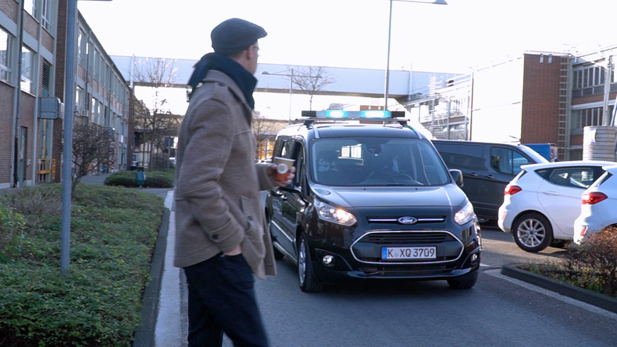
To
ensure testing was as realistic and natural as possible, the company created
the “Human Car Seat” that it installed inside a Transit Connect van. Designed
to look like an autonomous vehicle, with the driver hidden in the seat,
observers could more effectively gauge responses to a roof-mounted light bar
that flashed white, purple and turquoise to indicate when the van was driving,
about to pull forwards and giving way.
“Fundamentally,
people need to trust autonomous vehicles and developing one universal visual
means of communication is a key to that,” said Thorsten Warwel, manager, Core
Lighting, Ford of Europe.
“Turning
someone into a ‘Human Car Seat’ was one of those ideas when there was a bit of
a pause and then a realization that this was absolutely the best and most
effective way of finding out what we needed to know,” he said.
The
latest testing, which complements research already carried out in the U.S., was
conducted together with Chemnitz University of Technology, in Germany.
Researchers expanded the tests to check the effectiveness of two other colours,
in addition to white; a rooftop location, when the U.S tests had the lights
placed on the top part of the windshield; and situations with further distance,
showing the lights up to 500 metres away.
It
showed that 60 percent of the 173 people surveyed after encountering the
Transit Connect thought it was an autonomous vehicle. Together with the
observed reactions of a further 1,600 people, turquoise — more noticeable than
white and less easily confused with red than purple — emerged as the colour
that was preferred.
There
was also a high level of acceptance and trust in the signals, providing a basis
from which researchers can further develop and hone the visual language.

