Baskin-Robbins debuts a ‘fun’ new logo that maintains historical essence

Ice cream retailer Baskin-Robbins, which has 27 stores and generates more than 300 direct jobs in Puerto Rico, unveiled its new logo and campaign this week under the slogan “Always cool,” featuring a “unique and cheerful style, which evokes the happiness of sharing memorable moments around the enjoyment of high-quality ice cream.”
“With this new look, the brand once again transforms its image, maintaining its positive energy, its joy and its always young style,” the chain stated.
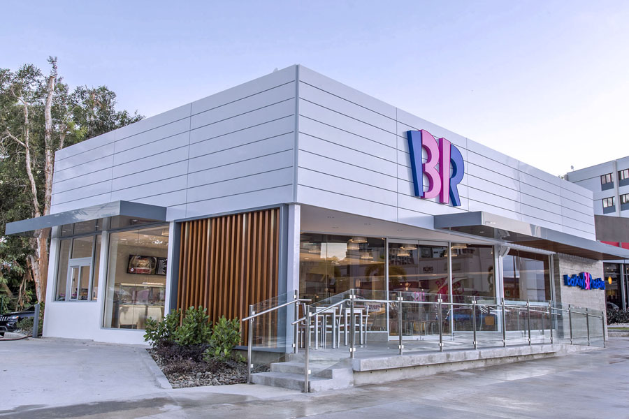
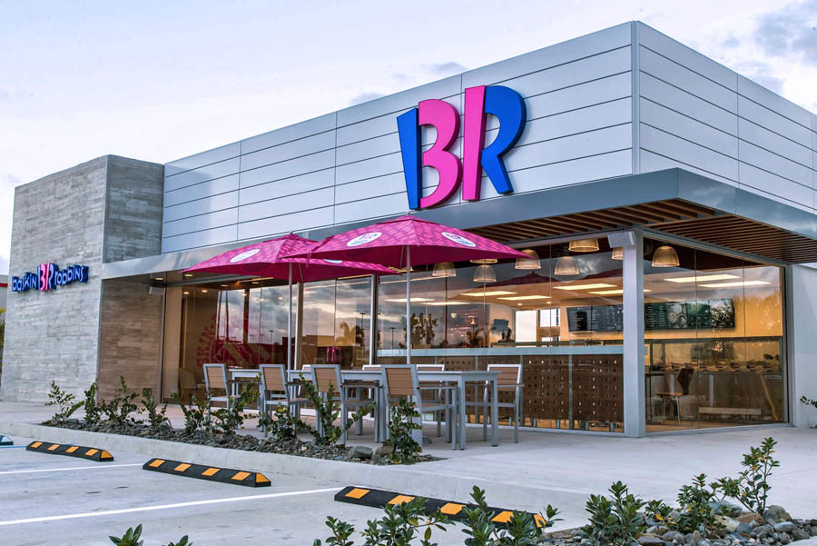
The image change was unveiled at the inauguration of the store at Los Colobos in Carolina. The new location required an investment of more than $1 million and created 30 direct jobs.
Baskin-Robbins in Puerto Rico is operated by Island Creamery Inc., a Grupo Larrea company. The first store on the island opened in 1976, but it was in 2016 that the Grupo Larrea acquired the rights to operate the brand.
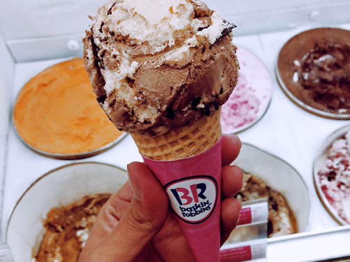
“Baskin-Robbins lovers, with their obsession with the 31 flavors, were the inspiration for the creation of the new logo. The design is based on the beginnings of the brand, with special attention to the original logo that dates to 1947,” said Juan Antonio ‘Tony’ Larrea, president of the Baskin-Robbins chain in Puerto Rico.
Pink continues to reflect the brand’s essence. A new color palette is incorporated, presenting a marriage between classic and modern, with a vibrant blue tone and strong browns. The Baskin-Robbins logo has seen five different versions, which have progressed through its 80 years.
“We’re excited about the opportunity to share the new Baskin-Robbins logo and image with Puerto Rico and that way contribute positively to unforgettable experiences for our guests. Our mission is to serve joy with every visit,” Larrea said.


