Op-Ed: Debrand the brand
Few weeks ago, a friend and client, while in a conversation, prompted me to give my opinion on a recently re-designed brand. He knew that I was responsible for the first and only review of that almost centenary brand (in six years and they will be 100), and the process of consulting, probing, and accepting, took a year and a half to materialize
Everything that is impacted by design must evolve. Brands too. As consumers, we follow the brands that we like, and as we evolve and follow trends, brands find themselves evolving as well. So, when brands change their looks, they must know that the best change is a subtle, upgraded version of its identity. Not a full make-up every time there is a rebranding need.
Rebranding says innovation all around without saying it. For this reason, that century-old brand that I reviewed a decade ago must be updated, even in its narrative, indeed, but was it necessary to have a full re-brand logo?
Redesigning a brand and its components must be based on a strategy and a process that analyzes how the brand could be impacted. Larger brands even conduct plenty of focus groups in different countries to test their threshold. Changing a logo and rebranding is a different business. Their nature needs specific reasons. Brand changes must keep the goodwill and maintain brand familiarity without mutilating the equity and recognition that has been invested in it. These announcements usually generate opinions.
Some are extreme. Gap, for example, reverted their new logo just six days after launching it. Why? The change was so abrupt that consumers threatened to boycott the company or else. The noise was so much that they had to retract, apologize, and hire a crisis management firm to deal with the deluge of reactions.
In recent years, and especially in the political and government arena, due to their internal culture that lacks the proper work procedures and validations, make them copy 100% graphic elements presenting them as their own, causing embarrassment when discovered. The current logo of the government of Puerto Rico had been integrated to an unaltered graphic element without a single change or alteration in color, shape or form. I’d like to see the invoice for that job that the public paid for. This was first noticed by Orlando Alberto Jesús Vélez-Sánchez.
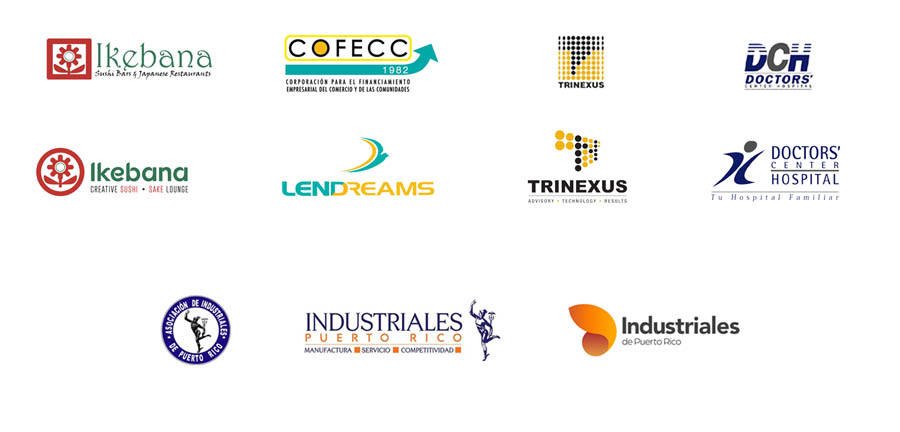
I have developed many names and logos for product and service brands throughout my career. Some of these remain as unchanged as when they were first conceived. For example, Doctors’ Center Hospital’s brand, the first and only change so far, had to be significant back then, because the hospital’s original logo had not been designed from a strategic brand communication principle.
The typographic proportions were unbalanced and made the full name illegible in tiny sizes. In addition, the purpose of creating a brand was also to establish a consistent brand system that could grow, as they have done uninterruptedly, by adding brand extensions such as locations, specialization, or departments to the actual logo. The original logo was based on monogramming its meaning (DCH) with intersected by lines both ‘D’ and ‘H’ with a solid ‘C’, followed bellow by DOCTORS’ and at an approximate reduction rate of 80%, ‘Center Hospital’. Last, the promise in a red color that read: “Your family hospital,” which brought it unnecessarily to three colors (the fewer colors the better).
Based on that context, we work on the three acronyms keeping the blue and the gray only, assigned a Pantone color, and created a combination of figures that intends to project a human figure, healthy, with vitality and moving, which in turn resembles implicitly to the initials “DCH” from its original logo. We added a more appropriate proportion to the full name with a semi-sans typeface, and we integrated a re-shaped voice into the brand’s language for more closeness (in Spanish ‘tu’ and ‘usted” refers to you, but in a different levels of closeness context).
To this day, the logo remains as it was originally conceived in 2007, and it may be a design that might not require changes in the immediate future, but it’s due. Fortunately, it did not succumb to the 3D effects and gradients that would have hurt the brand. These effects of passing fads can be integrated into ads with specific objectives, campaigns based on that style, but brands must think into the long term.
In the case of Ikebana, the effort was subtle yet significant: we suggest keeping the flower, but encircling it with a balanced thickness frame. The negative space gave details to the flower automatically. Also, we performed a significant typography change while increasing slightly the hue of their original red, we redesigned the description line below for more legibility and ambient experience as a promise.
COFECC was a brand with several challenges to address. First, the name was not phonetically pleasing, it had no rhythm, cadence and was difficult to pronounce. But the main reason was the confusion that its corporate name had with that of COSSEC, another financial related institution, besides their aim to have presence in other markets such as St. Thomas, Florida and Hispanic.
The brand offers financial aid, particularly to marginalized and disadvantaged sectors with main attention to women. So, we came up with LENDREAMS, based on the concept of lending for dreams. The logo change was particularly forceful, but we preserved the colors close to their original ones, refining their hue, however.
For the Puerto Rico Manufacturers Association (PRMA), the subject matter for which our friend asked us for perspective, we removed back then the circle that enclosed the figure of Mercury (Hermes), we added a secondary color (orange), and we choose a set of fonts, a serif, to institutionality and a sans serif for the rest. We placed the figure running toward its name. In this logo, we also eliminated the word “Association” and “DE” leaving only Industriales Puerto Rico. In the description below “manufacturing, service and competitiveness.”
This third revision, however, goes against the new trend of simplicity as Bloomberg’s Ben Schott explains, where brand designs are returning to a necessary sobriety and simplicity. Adding enthusiasm to the messages and leaving the brand legible, present, sober, and even stoic. The brand belongs to the one who values and identities with it. For this reason, the brand must be committed to making you fall in love. It must come alive.
The friend who called me has one of the qualities I admire most: his candor coupled with wisdom. He was aware that my agency had worked on the first re-branding, and while I have a professional opinion on this evolution, I will still describe where it succeeded.

From a graphic point of view, the balance, the typographical use, the use of shape, its volume, font and kerning, the use of lowercase, is perfect. Adding “from Puerto Rico” complements the last name very well, but it may be lost in smaller spaces. They must have suggested it in their brand book. There is professionalism and attention to detail. But it is also our responsibility as professionals to give due warning of the risks involved in making such an abrupt jump from a logo like this.
The PRMA is recognized in multigenerational groups and will know how to renew itself, as it has been doing. They ditched the centenary blue (Reflex Blue, some understand) and gave prominence to a color newly introduced a little over a decade ago.
The synthesis that pretends to represent the wing of the Greek god still leaves me trying to decode the analogy. The decision was made collectively, I’m sure. I would have liked to look at the second and third options, but that will be only for their records.
There is no rule set in stone. If it’s true that the trend seeks re-simplification or “debranding” as Bloomberg explains, brands belong to their markets, their audiences and those who hold them as significant, so brands must follow these new tendencies of market consumption of design. A professional association is not going to generate passions like those of GAP generated. But I’m certain of critics that probably do not have the way to express what’s not to like.
The brand must ensure that its significance is precise, its institutionality respected and its elements are tended to in a gradual transition unless the change that is required is urgent and absolutely necessary. Even so, the strategic process must always precede.
Here are some other brand developments that I have worked on and deserve to be in this column because they have helped me to exercise the muscle of brand observation.